- Published on
CSS in real world - Re-create Vercel Develop. Preview. Ship. with Tailwind CSS
- Authors

- Name
- Thang Huu Vu
- @thanghvu
Table of Contents
Intro
Earlier this week I tweeted about a Tailwind Play version of Vercel "Develop. Preview. Ship" Hero Header. Here is how it looks like on Vercel Homepage:
Seeing simple yet effective CSS like this is always fascinating to me. I eventually adapted the animation for this site's Hero. Let's discuss the technical details behind this piece as we re-create it using Tailwind.
Goal
Let's aim for the closest we can get to achieve this look. I will cover:
- Typography
- Gradient
- Animation
Breakdown
From the Vercel homepage, we can see that the markup looks like this:
<h1 class="hero_title__2dqLj" aria-label="Develop. Preview. Ship.">
  <span
    class="animated-gradient-text_background__104Eo animated-gradient-text_background-1__2q1-A"
    style="--content:'Develop.';--padding:0.05em;--start-color:#007CF0;--end-color:#00DFD8"
  >
    ::before
    <span
      class="animated-gradient-text_foreground__2kjjY animated-gradient-text_foreground-1__3O_nT"
      >Develop.</span
    ></span
  ><span
    class="animated-gradient-text_background__104Eo animated-gradient-text_background-2__3r8da"
    style="--content:'Preview.';--padding:0.05em;--start-color:#7928CA;--end-color:#FF0080"
  >
    ::before
    <span
      class="animated-gradient-text_foreground__2kjjY animated-gradient-text_foreground-2__BYeW7"
      >Preview.</span
    ></span
  ><span
    class="animated-gradient-text_background__104Eo animated-gradient-text_background-3__3Bvxj"
    style="--content:'Ship.';--padding:0.05em;--start-color:#FF4D4D;--end-color:#F9CB28"
  >
    ::before
    <span
      class="animated-gradient-text_foreground__2kjjY animated-gradient-text_foreground-3__3Khgf"
      >Ship.</span
    ></span
  >
</h1>
Noted that each span element contains a descendant span and a pseudo-element. While the outer span contains information about gradient colors, the ::before pseudo-element is holding the black text (background), and the inner span is holding the gradient text (foreground). The background and foreground take turns to show on the screen, consecutively between the three words.
Implementation
Typography
- Font choice: Vercel uses Inter font. (I skip this).
- Font weight: extra-bold (800)
- Font size:
23vwfor default (mobile) and10remfor desktop - Letter spacing:
0.06rem.
The last two do not default in Tailwind. Therefore, you need to customize it. Here are two ways you can customize utility classes:
- Use bracket
- Extend configuration
Let's extend letterSpacing configuration:
module.exports = {
  theme: {
    extend: {
      fontSize: {
        '10xl': '10rem',
      },
      letterSpacing: {
        tightest: '-.06em',
      },
    }
  }
}
And create the markup using the customization:
<h1 class="py-14 text-[23vw] sm:text-10xl leading-none select-none tracking-tightest font-extrabold text-center">
  <span class="relative block">
    <span class="px-2">
      Develop.
    </span>
  </span>
  <span class="relative block">
    <span class="px-2">
      Preview.
    </span>
  </span>
  <span class="relative block">
    <span class="px-2">
      Ship.
    </span>
  </span>
</h1>
Here is how it should look like for now.
Gradient
To achieve the gradient background effect for the foreground text, we combine the Gradient Stops and Background Clip utilities. Via inspection, we can extract the colors and add them to the config:
module.exports = {
  theme: {
    extend: {
      fontSize: {
        '10xl': '10rem',
      },
      letterSpacing: {
        tightest: '-.06em',
      },
      gradientColorStops: {
        'gradient-1-start': '#007CF0',
        'gradient-1-end': '#00DFD8',
        'gradient-2-start': '#7928CA',
        'gradient-2-end': '#FF0080',
        'gradient-3-start': '#FF4D4D',
        'gradient-3-end': '#F9CB28',
      },
    }
  }
}
Applying back these to the markup:
<h1 class="py-14 text-[23vw] sm:text-10xl leading-none select-none tracking-tightest font-extrabold text-center">
  <span class="relative block">
    <span class="px-2 text-transparent bg-clip-text bg-gradient-to-r from-gradient-1-start to-gradient-1-end"> Develop.</span>
  </span>
  <span class="relative block">
    <span class="px-2 text-transparent bg-clip-text bg-gradient-to-r from-gradient-2-start to-gradient-2-end"> Preview.</span>
  </span>
  <span class="relative block">
    <span class="px-2 text-transparent bg-clip-text bg-gradient-to-r from-gradient-3-start to-gradient-3-end"> Ship.</span>
  </span>
</h1>
What is going on? For the foreground, we set the background color to gradient, using utilities from- and to-. Then, we use text-transparent and bg-clip-text to clip the text & achieve the gradient text effect.
Tip: Besides
from-andto-, you can also usevia-to add a middle color in your design.
We are making good progress! Now the text should have vivid gradient colors. Here is how it should look like.
Animation
This is the most exciting part. It should be clear now how the animations are designed. You can see the timeline for animation using Firefox inspector tools. Open the inspector window and check the Animation tab.
Take the first span as an example. Here we can see background and foreground animations:
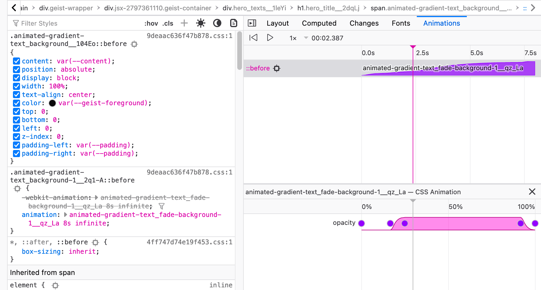
Fig. 1.1 The foreground animation
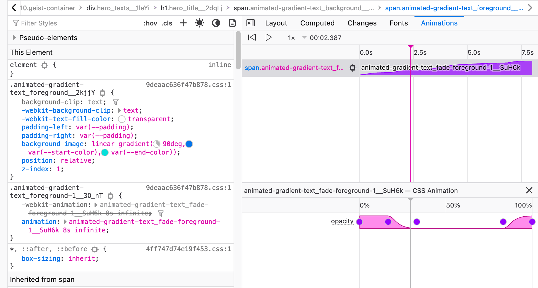
Fig. 1.2 The foreground animation
The figures show that the two animations overlapping each other (see the charts). Before the foreground appears, the background smoothly fades in. This keeps running infinitely, with an 8-sec interval.
::before pseudo element
Let's first style the pseudo-element:
<h1 class="py-14 text-[23vw] text-center sm:text-10xl leading-none select-none tracking-tightest font-extrabold">
  <span data-content="Develop." class="relative block before:content-[attr(data-content)] before:w-full before:z-0 before:block before:absolute before:top-0 before:bottom-0 before:left-0 before:text-center before:text-black">
    <span class="px-2 text-transparent bg-clip-text bg-gradient-to-br from-gradient-1-start to-gradient-1-end"> Develop.</span>
  </span>
  <span data-content="Preview." class="relative block before:content-[attr(data-content)] before:w-full before:z-0 before:block before:absolute before:top-0 before:bottom-0 before:left-0 before:text-center before:text-black">
    <span class="px-2 text-transparent bg-clip-text bg-gradient-to-br from-gradient-2-start to-gradient-2-end"> Preview.</span>
  </span>
  <span data-content="Ship." class="relative block before:content-[attr(data-content)] before:w-full before:z-0 before:block before:absolute before:top-0 before:bottom-0 before:left-0 before:text-center before:text-black">
    <span class="px-2 text-transparent bg-clip-text bg-gradient-to-br from-gradient-3-start to-gradient-3-end"> Ship.</span>
  </span>
</h1>
- We want the pseudo-element to be
absolutepositioned within the outerspan. - Use
data contentandbefore:content-[attr(data-content)]to fill content inside pseudo-elements. - You should see the display is all black now, as the pseudo-element is overlaying the descendant
span. This is expected.
Animations
Animation utilities in Tailwind CSS are enabled by default. To write custom animation, go to tailwind.config.js. We need to extend keyframes & animation. The value are extracted from Vercel:
module.exports = {
  theme: {
    extend: {
      fontSize: {
        '10xl': '10rem',
      },
      letterSpacing: {
        tightest: '-.06em',
      },
      gradientColorStops: {
        'gradient-1-start': '#007CF0',
        'gradient-1-end': '#00DFD8',
        'gradient-2-start': '#7928CA',
        'gradient-2-end': '#FF0080',
        'gradient-3-start': '#FF4D4D',
        'gradient-3-end': '#F9CB28',
      },
      keyframes: {
        'gradient-foreground-1': {
          'from, 16.667%, to': {
            opacity: 1,
          },
          '33.333%, 83.333%': {
            opacity: 0,
          },
        },
        'gradient-background-1': {
          'from, 16.667%, to': {
            opacity: 0,
          },
          '25%, 91.667%': {
            opacity: 1,
          },
        },
        'gradient-foreground-2': {
          'from, to': {
            opacity: 0,
          },
          '33.333%, 50%': {
            opacity: 1,
          },
          '16.667%, 66.667%': {
            opacity: 0,
          },
        },
        'gradient-background-2': {
          'from, to': {
            opacity: 1,
          },
          '33.333%, 50%': {
            opacity: 0,
          },
          '25%, 58.333%': {
            opacity: 1,
          },
        },
        'gradient-foreground-3': {
          'from, 50%, to': {
            opacity: 0,
          },
          '66.667%, 83.333%': {
            opacity: 1,
          },
        },
        'gradient-background-3': {
          'from, 58.333%, 91.667%, to': {
            opacity: 1,
          },
          '66.667%, 83.333%': {
            opacity: 0,
          },
        },
      },
      animation: {
        'gradient-background-1': 'gradient-background-1 8s infinite',
        'gradient-foreground-1': 'gradient-foreground-1 8s infinite',
        'gradient-background-2': 'gradient-background-2 8s infinite',
        'gradient-foreground-2': 'gradient-foreground-2 8s infinite',
        'gradient-background-3': 'gradient-background-3 8s infinite',
        'gradient-foreground-3': 'gradient-foreground-3 8s infinite',
      }
    }
  }
}
It's time to apply the class back to our markup. Here is how it should look like at the end. Spoiler alert: The classnames are long 😆
Conclusion
You can see the source code of this site Hero to see how I implemented it. Hope you enjoyed the read.